In user interface and software design, the principle of least astonishment states that "if a necessary feature has a high astonishment factor, it may be necessary to redesign the feature." It means that your user interface should behave in a way that the user expects, based on their prior knowledge of how similar interfaces behave.
This is a rant about Mac OS X.
I've just spent pretty much the whole day redoing the website for RiveScript.com, and I think it looks pretty nice.
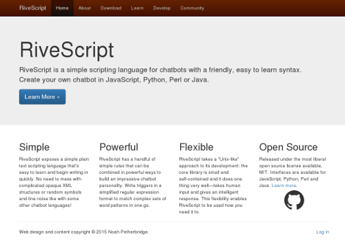
RiveScript.com was the final website on my server that was still running on my legacy PerlSiikir CMS, and it's been on my to-do list for a while to get it migrated over to my new Python CMS, Rophako like what Kirsle.net is currently running on. The old Perl code was clunky and ugly and memory-leaky, and now I'll be at ease if I ever need to migrate to a new web server, as my Python web apps are extremely quick to get up-and-running, whereas it was an hours-long ordeal to get PerlSiikir to run.
So, the bulk of the work actually needed for RiveScript.com was purely front-end. I revamped the whole web design to use Twitter Bootstrap and make it look all hip and edgy like how all the other small software project websites are these days.
Besides the programming language on the back-end, I had other reasons for why I wanted to simplify RiveScript.com: I don't have the motivation or energy to do as much with that site as I did previously.
I used to run a YaBB Forum on RiveScript.com, but it wasn't extremely active and it was getting hit by too many spam bots, so several months ago I shut that down and linked to the RiveScript forum at Chatbots.org.
More recently I had programmed a chatbot hosting service that was on RiveScript.com, but that wasn't very popular either. I know nobody was using it because it had been broken for months and I hadn't heard any complaints. ;) A couple months ago I sunsetted that feature by turning off new site registrations and removing some references to the feature. And now that's officially gone! If you actually had a bot hosted there, contact me and I can get you your bot's reply files back.
So, the new site is simple and minimalistic and is just about the RiveScript language itself. It was an ordeal rewriting all of the pages from scratch (well, most of them) but now that it's done, the site should be very low-maintenance for me.
One of the most fun parts of it was that I ported over my "Try RiveScript Online" page to use JavaScript and run in the browser, whereas the old version had a Perl back-end (because a JavaScript version of RiveScript didn't exist at the time), so that's even one less thing for me to maintain and make sure it doesn't break. :)
And, the front-end pages for the new site are also open source, FWIW.
These are just some of my thoughts on things that a Minecraft clone should probably do differently to Mojang's (well, Microsoft's) Minecraft, since a clone would be starting from scratch anyway and would be in a good position to fix some of the fundamental problems in the original game that are impossible/unlikely to be fixed by Microsoft.
Some of the Minecraft clones I'm familiar with so far are Terasology, Minetest, and Michael Fogleman's Craft. So far, Craft seems to do the most things "right" (as far as my list of fundamental improvements on Minecraft go) such as only storing changes to the blocks to disk rather than whole entire chunks, but more on that in a minute.
Disclaimer: I'm not a game developer. I am a software developer and have a particular interest in the technology used in games, i.e. I have the knowledge to write code for most given game mechanics and spend countless hours thinking about these sorts of things. I've read a lot about the technical internals of Minecraft and have read some of the source code to these clones, so this blog post is full of my own educated opinions on things. I may, at some point, take on the challenge of creating a Minecraft clone of my own, but until then these are just the things I've been thinking about over the last several months.
Wanna see a Twitter Bootstrap site that doesn't look like a Bootstrap site? You're looking at one right now!
I've updated the web design for Kirsle.net to use Bootstrap, so now the site is more accessible to mobile browsers. Try resizing the browser window and see how the site reacts. On smaller screens, the left nav bumps to the bottom of the page and a button appears at the top that will scroll straight to the nav bar.
I made a few custom tweaks for my particular design though, because the fixed (non-scrolling) background image and the transparent backgrounds on the panels would cause rendering errors on Firefox for Android. So, when the screen is small enough to switch into "mobile mode", the background image becomes unfixed (so it will scroll away with the rest of the page), and the panels lose their transparent backgrounds.
I've also added a new section to my site where you can see past web designs of Kirsle.net and see how each design was typically an evolution of a prior one.
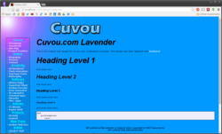
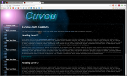

The design looks the same as before, except now, all the see-thru transparent bits in the design, now, are truly see-thru, and now the main background image (with the purplish sun) will stay put while you scroll the page. Also, the blue borders around the navigation and content panels are now rendered by the web browser via CSS instead of being static images.
The reason the design was so "flat"/"fake" before, is because Internet Explorer 6 and older don't support true alpha transparency in PNG images very well, and I was trying to make my web design as accessible as possible to all browsers. But recently I found it's hard for me to read the text on my own site at times, and it's usually only a problem further down on a page where there's nothing but text, and the starry background image. So, now the purple sun will stay put and add some flair to the page no matter where you scroll it to. :)
Internet Explorer 6.0 and older will still be served the old layout with the flat images with fake transparency and a scrolling background; all other browsers will get the new layout with the true transparency and CSS-rendered borders. :)
Next time I completely replace the web design, IE 6 and older won't be getting any love; if that browser chokes on alpha-channel PNG images it's not my problem; that browser is a decade old.
Here's a screenshot from the homepage:
Here's a random idea that just popped into my head: to help with the security of CGI scripts, certain HTML elements in the forms can be "tagged" in various ways depending on what their function will be once submitted.
So a textarea for leaving a comment can be tagged with name="ta-comment" (ta means textarea), and an input box meant for entering user names only could be tagged with name="user-login", and an input box meant for entering numeric zip codes can be tagged name="num-zipcode".
Then, the CGI script, when it first begins parsing the query string and form parameters, can automatically apply global filters to the inputs based on their tag. This way, every input that might potentially be used to access the filesystem can be filtered so that it doesn't contain any special characters that could introduce a vulnerability in the script, but fields that are meant to be more verbatim (i.e. comment boxes) can be left largely untouched.
# Create a CGI object
my $q = new CGI();

# This will hold your script's parameters
my $args = {};

# Get all the params.
foreach my $what ($q->param) {
    my $is = $q->param($what);

    # Filter the value based on the tag.
    if ($what =~ /^num\-/) {
        # Numbers only!
        $is =~ s/[^0-9]//g;
    }
    elsif ($what =~ /^user\-/) {
        # Usernames are numbers and letters only!
        $is =~ s/[^A-Za-z0-9]//g;
    }
    elsif ($what =~ /^ta\-/) {
        # Textareas turn their line breaks into <br>
        $is =~ s/\n/<br>/g;
        $is =~ s/\x0d//g;
    }
    $args->{$what} = $is;
}
So this way, as you write your front-end HTML code and the back-end Perl, you can tag all the inputs based on how the back-end code will plan on using them once submitted, and the code that collects the parameters when the form is submitted will be sure to format them in a consistent way. So, if your web application consistently doesn't allow quotation marks or HTML code in their text boxes, you can make the CGI automatically remove these things from all your incoming fields, and then just specially tag the ones that you want to be treated differently.
It would protect against accidental oversights by the programmer, and the end user can't do anything about it either. If the text box's name is "num-zipcode", the CGI script will always remove non-numbers when submitted and the user can't do anything about it. If they try to rename it with Firebug to be "text-zipcode" or anything like that, your CGI script won't use their version because it's not named as "num-zipcode."
I think I'll try implementing something like this next time I create a new web application.
@font-face attribute of CSS 3, which allows you to embed a TrueType Font file on a web page, so that the user will see the font on your page even if they don't have the font installed on their computer.This feature has been possible in Internet Explorer since version 4.0, but IE uses a variant of OpenType Font instead of TrueType. IE was the only browser to support such a thing for a long time, so it never really caught on.
Now that Firefox and other CSS3-supporting browsers are implementing @font-face for TTF, we can combine that feature with IE's support for EOT font files and get embeddable fonts to work on both browsers.
I have a demonstration here: Embedded Font Test. This page embeds my Rive font, which is available (in TTF form) from my Fonts page.
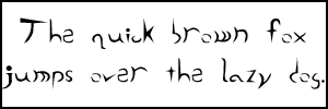
To convert TTF to EOT files, you can use Microsoft's WEFT tool which has been around since the dark ages, but I much prefer ttf2eot, hosted at Google Code. This is a no-nonsense tool that gets straight to the point of converting a font file without the hassle of dialogs that must be clicked through with WEFT. Oh, and there's conveniently a Windows executable already built, just grab it from the Downloads page.
Usage is pretty straightforward:
ttf2eot < Rive.ttf > Rive.eotAnd then embedding the pair of fonts on a page that is compatible with both IE 6 and Firefox 3.5 (and I imagine other CSS3-compliant browsers, though I haven't tested them):
@font-face {
font-family: Rive;
src: url("Rive.eot") /* For IE 6+ */
}
@font-face {
font-family: Rive;
src: url("Rive.ttf") /* For CSS3 browsers inc. Firefox */
}
body {
background-color: #000000;
color: #FF9900;
font-family: Rive;
font-size: 16pt
}
IE 6 knows to ignore the TTF entry, and Firefox knows to ignore the EOT entry, as each browser can't display the opposite type of font.
I compared the settings between this monitor and the Hanns-G... the Hanns-G has 100 for brightness/contrast and for R/G/B; the Dell has 67 for brightness/contrast, and maxing them out whitewashes the entire image and makes the contrast even more horrible. So I'm at the conclusion that probably all Dell monitors have this issue, so I don't think I'll ever buy one for personal use.
Here is a new picture of an LCD monitor test page viewed on both monitors simultaneously. It very clearly shows the difference, and no, the Dell monitor can't be reconfigured to show the contrast correctly. dell-white.jpg (caution: 4000x3000 pixel resolution).
Now the original blog post follows.
Here's a rant I've been wanting to go on about the Dell E176FP LCD monitors.
These monitors suck!
My college used these monitors everywhere, because they bulk ordered cookie-cutter Dell machines to use as every workstation in every lab in the entire campus. And all of these monitors were just terrible.
I first realized how terrible they are at campus because the brightness on every monitor was set very dark, and this annoyed me. But I couldn't do much about it. Yes, the brightness and contrast was only at 75%, but if I upped those, the screen would become "too" bright -- everything would be white-washed. Subtle changes in gray, such as the status bar on Firefox compared to the white background of a web page, would blend together and there would be no distinguishable separation at all. And, if the Windows machine happened to have the Classic skin, you couldn't tell where status bars ended and the task bar begins.
A white-washed monitor is not usable by any stretch of the imagination.
And then, the monitor I had at my workstation at the office was one of these terrible Dell monitors. Fortunately, I didn't have to deal with it for very long, because all the engineers soon got NVIDIA cards and second monitors, to make us work more efficiently. These new monitors were Hanns-G, 1440x900 pixel LCDs.
I run Linux at my workstation, and with the second monitor, I decided that I'd run a virtual Windows XP machine full-screen in one monitor, and keep the other monitor dedicated to Linux for development. I chose the new Hanns-G monitor to run the Linux half, and the Dell monitor to run the Windows half.
I still kept noticing the color quality differences in the monitors, though. I'd use Windows almost exclusively to test our front-end web product, but every now and then I'd also test it in Linux. On the Hanns-G monitor, the web pages were so bright and colorful, compared to on the Dell monitor. It was like taking off your sunglasses after wearing them for half the day and being amazed how bright the world is.
But this still wasn't too bad.
Some time later, I configured Linux in an interesting way on my laptop, having it run the GNOME desktop environment but use XFCE's window manager. I had all kinds of semi-transparency effects on it, like having the menus be see-through as well as the window decorations. I took a screenshot to send to one of my friends, and I previewed this screenshot in Windows on this crappy Dell monitor, and this is where I officially started to hate this monitor.
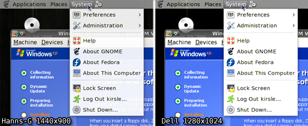
The Dell monitor, being SO terrible with color quality, was NOT able to display the transparency in the popup menu there! The menu was probably 10% transparent. Now mind you, this is a screenshot. I wasn't asking the monitor to render semi-transparency. It only had to display what had already been rendered. And it failed!
The menu bar has a solid gray background, not transparent at all. The panel and window borders were still see-through, because I gave them higher transparency levels, but even then the panel looks a bit more milky-white on the Dell monitor.
So, I swapped the monitors; now Linux uses the crappy color-challenged Dell monitor, since I primarily use the Linux half for development in text-based terminals, and the Windows half gets the Hanns-G monitor where I can see everything in their full colors.
Since the monitor has nothing to do with how the colors actually are to the computer, I couldn't just take a screenshot to show you the difference. So, on the Hanns-G monitor, I opened the screenshot in Photoshop and applied +20 contrast to it, which made it look pretty darn close to the same screenshot viewed on the Dell monitor.
Here are links to the full-size PNG screenshots, so you can see all the differences yourself. Note that if you have such a Dell monitor, and these screenshots look pretty much exactly the same, you're verifying my point. These Dell monitors are crap!
</rant>
Right now, my page doesn't validate as HTML 4.01 Strict, because <script> tags aren't allowed to have a id attribute. What script tag has the ID attribute? The one to display the countdown until Fedora 10's release. If I remove the ID attribute, the script breaks. Nonetheless I'm going to keep it there only for the next three days until Fedora 10 finally arrives, then it's history and next time I want to count down until Fedora 11, I'll find my own implementation instead of pasting their awful HTML code into my otherwise perfect pages.
I've ranted about pasting external code into my site before, so I'll spare you any continued rambling for now. Sometime when I'm more motivated I might follow up on this rant with a sequel.
The moral of the story is, don't give me any code to paste anywhere in anything I have unless the code is completely valid and passes all validation tests (for HTML, that means it passes HTML 4.01 Strict standards).
Speaking of which, I wanted to say a little something about web development. Why have a degree in web design?, some people ask. Any 12-year-old can open Notepad and create a web page. I agree -- and I was that 12-year-old at one point in my life. What separates the men from the boys is the ability to create a web page that validates against the W3C's strictest standards. Yeah, any little kid can throw together a mess of HTML tags and get something out of it. They might even be lucky enough that their page works on every browser. But I've heard enough crying and complaining about how the W3C doesn't validate their page, how they get errors in the triple digits or worse whenever they try to validate their code.
So that's why web development is a skill and not a hobby. With the exception of the Fedora banner (which I highly regret embedding), all my pages on this site and every other site I develop, they all validate HTML 4.01 Strict. Not Transitional -- Strict. That means the W3C doesn't take any shit from my pages whatsoever. And that, my critics, is what sets me apart from the 12-year-olds with Notepad.
0.0037s.