I compared the settings between this monitor and the Hanns-G... the Hanns-G has 100 for brightness/contrast and for R/G/B; the Dell has 67 for brightness/contrast, and maxing them out whitewashes the entire image and makes the contrast even more horrible. So I'm at the conclusion that probably all Dell monitors have this issue, so I don't think I'll ever buy one for personal use.
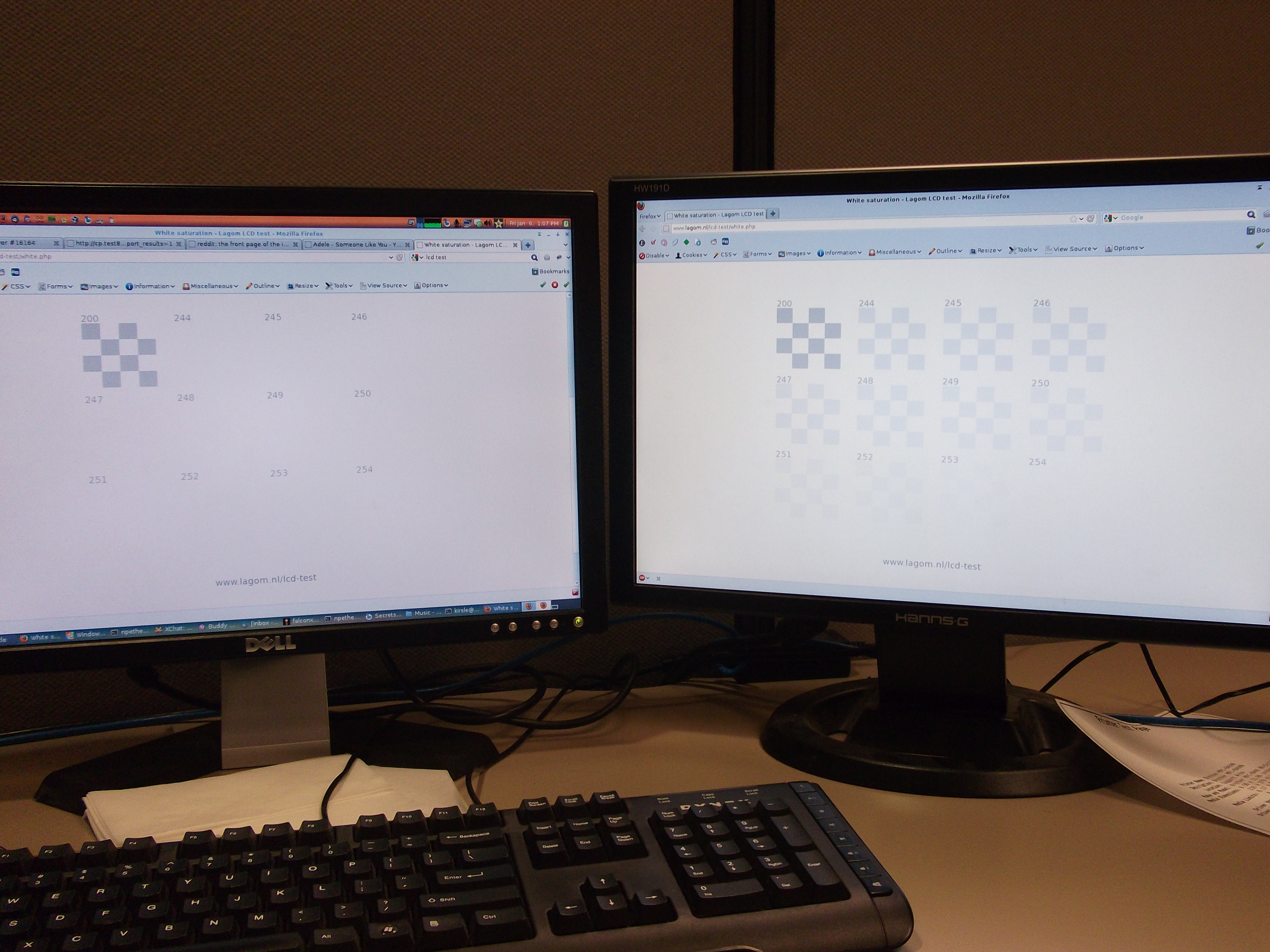
Here is a new picture of an LCD monitor test page viewed on both monitors simultaneously. It very clearly shows the difference, and no, the Dell monitor can't be reconfigured to show the contrast correctly. dell-white.jpg (caution: 4000x3000 pixel resolution).
Now the original blog post follows.
Here's a rant I've been wanting to go on about the Dell E176FP LCD monitors.
These monitors suck!
My college used these monitors everywhere, because they bulk ordered cookie-cutter Dell machines to use as every workstation in every lab in the entire campus. And all of these monitors were just terrible.
I first realized how terrible they are at campus because the brightness on every monitor was set very dark, and this annoyed me. But I couldn't do much about it. Yes, the brightness and contrast was only at 75%, but if I upped those, the screen would become "too" bright -- everything would be white-washed. Subtle changes in gray, such as the status bar on Firefox compared to the white background of a web page, would blend together and there would be no distinguishable separation at all. And, if the Windows machine happened to have the Classic skin, you couldn't tell where status bars ended and the task bar begins.
A white-washed monitor is not usable by any stretch of the imagination.
And then, the monitor I had at my workstation at the office was one of these terrible Dell monitors. Fortunately, I didn't have to deal with it for very long, because all the engineers soon got NVIDIA cards and second monitors, to make us work more efficiently. These new monitors were Hanns-G, 1440x900 pixel LCDs.
I run Linux at my workstation, and with the second monitor, I decided that I'd run a virtual Windows XP machine full-screen in one monitor, and keep the other monitor dedicated to Linux for development. I chose the new Hanns-G monitor to run the Linux half, and the Dell monitor to run the Windows half.
I still kept noticing the color quality differences in the monitors, though. I'd use Windows almost exclusively to test our front-end web product, but every now and then I'd also test it in Linux. On the Hanns-G monitor, the web pages were so bright and colorful, compared to on the Dell monitor. It was like taking off your sunglasses after wearing them for half the day and being amazed how bright the world is.
But this still wasn't too bad.
Some time later, I configured Linux in an interesting way on my laptop, having it run the GNOME desktop environment but use XFCE's window manager. I had all kinds of semi-transparency effects on it, like having the menus be see-through as well as the window decorations. I took a screenshot to send to one of my friends, and I previewed this screenshot in Windows on this crappy Dell monitor, and this is where I officially started to hate this monitor.

The Dell monitor, being SO terrible with color quality, was NOT able to display the transparency in the popup menu there! The menu was probably 10% transparent. Now mind you, this is a screenshot. I wasn't asking the monitor to render semi-transparency. It only had to display what had already been rendered. And it failed!
The menu bar has a solid gray background, not transparent at all. The panel and window borders were still see-through, because I gave them higher transparency levels, but even then the panel looks a bit more milky-white on the Dell monitor.
So, I swapped the monitors; now Linux uses the crappy color-challenged Dell monitor, since I primarily use the Linux half for development in text-based terminals, and the Windows half gets the Hanns-G monitor where I can see everything in their full colors.
Since the monitor has nothing to do with how the colors actually are to the computer, I couldn't just take a screenshot to show you the difference. So, on the Hanns-G monitor, I opened the screenshot in Photoshop and applied +20 contrast to it, which made it look pretty darn close to the same screenshot viewed on the Dell monitor.
Here are links to the full-size PNG screenshots, so you can see all the differences yourself. Note that if you have such a Dell monitor, and these screenshots look pretty much exactly the same, you're verifying my point. These Dell monitors are crap!
</rant>
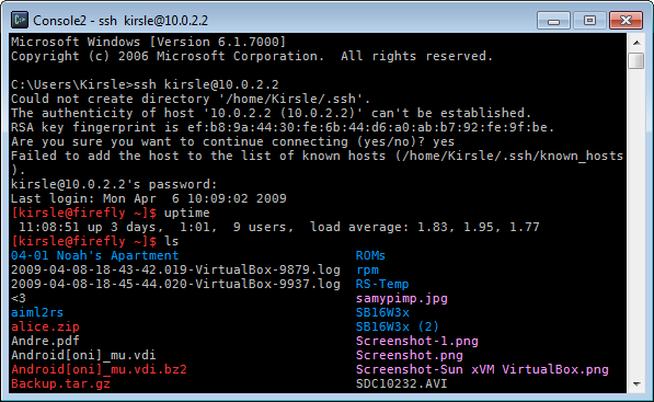
I've just discovered a program called Console. It's a command prompt replacement for Windows, and is much more like a Linux terminal emulator. Not quite gnome-terminal, but much better than cmd.exe:
Why it's so much better than command prompt:
I also recommend OpenSSH for Windows. It installs OpenSSH from the Cygwin project, without the entire Cygwin installation (which is enormous, and is overkill if all you want is SSH from it). With this you can open a command prompt or Console window and use SSH as though you were on a Linux system.
These two programs are all I need to feel more at home when I have to use a Windows system. :)
showkey`. This program shows you the decimal key code for any key on the keyboard that you type in, and quits after 10 seconds since your last keypress.
More interestingly, it warned me that the X Server was running, and that the results might be off a little because the X Server also reads from /dev/console. Apparently /dev/console outputs some binary for all your keypresses, and only root has read access to it (this is probably a good thing). I'm not sure yet what /dev/console binds to, but it seems that whatever your active console (or X session) is, that's what keypresses can be seen there.
If you do `cat /dev/console` as root and type stuff, the terminal prints two binary characters for each keypress. With this one could theoretically make a keylogger. So, out of boredom and to see if I could, I started writing a Perl script to read from /dev/console. For obvious reasons I won't release any code, but for the curious (and those more knowledgeable than the script kiddies)...
I'm relatively sure that the two bytes should be read together as a signed short 32-bit integer. That is, I convert it to decimal and then 4 hex characters by doing this:
my $dec = unpack("S", $buffer);
my $hex = sprintf("%04x", $dec);
From now on, a "byte" refers to a pair of hexadecimal characters. So "1e9c" is two bytes, 1e and 9c.
It seems that the first byte tends to indicate the key typed on the keyboard, and when converted to decimal shows the same number as showkey does. The second byte might be a modifier on the first byte, for example all four arrow keys send the key code 0xE0 as their first byte, and then the second byte is 0x48 for up, 0x50 for down, 0x4D for right and 0x4B for left.
There's almost no documentation about how to read the binary coming in from /dev/console. I had to look at the source code of showkey.c to get more of an idea. Once I realized that the first byte lines up with the decimal codes given by showkey, that helped a lot. The second byte is weird though: it seems to depend on the character you typed before it. For instance:
1e 9c - Pressed a
1e 9e - Pressed a
1e 9e - Pressed a
30 9e - Pressed b
30 b0 - Pressed b
30 b0 - Pressed b
1e b0 - Pressed a
1e 9e - Pressed a
1e 9e - Pressed a
30 9e - Pressed b
1e b0 - Pressed a
So my Perl script catches a lot of keys, then every now and then the "mode" randomly changes or something and the whole entire keymap gets shifted by about 100; I've figured these were for capital letters or when the shift key was pressed and added the capital letters to my key map, but I don't know why it does this. At any rate, I forgot I left my script running when I locked my screen, and unlocked it to see that it logged my entire password.
It'd be great if there was actually some documentation about this, but I've discovered a lot about it just from tinkering with it so far.
From my end it appears nothing has broken yet, but while stuff is getting sorted out this site may be unresolvable at times. If I notice a significant drop in my daily unique visitors over a few days I'll revert to my registrar's name servers. ;)
Maybe they just want the links to be there for Google to see... to improve the page rank of their scam site so that it comes up higher in Google search results. They just want links from the forums they spam, not necessarily clicks.
Thus an interesting idea for web forum software: add a kind of restriction on link posting. Like how some forums require that you post 10 things that aren't spam before you're allowed to send private messages to other users, or other such arbitrary restrictions... what would be useful is one that goes: you can post links immediately after signing up, but every link you post will have rel="nofollow" attached to it, so that Google and other search spiders won't follow your link, and you won't get Pagerank credit for it. And then after posting enough on the forum, all your previous links and all future links will be linkable for search engines then.
Spam bots always seem to find ways to register and spam forums, but taking away their ability to get any Pagerank credit for their spamming would help fight back just a little bit.
/random thought of the day/
[noahp ~]$
Broadcast message from matts (pts/45) (Thu Jul 17 15:45:02 2008):

stop putting crap on this box, we're at 100% usage

Broadcast message from gregc (pts/2) (Thu Jul 17 15:45:50 2008):

Your wall message, dirties my screen

Broadcast message from matts (pts/45) (Thu Jul 17 15:46:08 2008):

good

Broadcast message from joels (pts/37) (Thu Jul 17 15:47:01 2008):

is this how wall works?

Broadcast message from noahp (pts/55) (Thu Jul 17 15:47:23 2008):

People, use /usr/bin/sayto >.<

Broadcast message from benl (pts/72) (Thu Jul 17 15:47:37 2008):

STOP WALLING ME!!111one

Broadcast message from matts (pts/45) (Thu Jul 17 15:47:45 2008):

there is no '*' option in sayto

Broadcast message from noahp (pts/55) (Thu Jul 17 15:48:01 2008):

Where we're going we don't need *'s

Broadcast message from carlof (pts/49) (Thu Jul 17 15:48:12 2008):

looolloololoolllool

Broadcast message from carlof (pts/72) (Thu Jul 17 15:48:13 2008):

oh hai
From: Samy <samy@...>
To: everyone <...>
Date: Thu Jul 17 15:51 2008
Subject: wall

Each time you wall on web11, you're disrupting 12 developers from working and possibly systems team or QA. Don't do this.
[noahp ~]$ wall
Don't be a jerk


Use hud, email, a phone, don't fing use this
Right now, my page doesn't validate as HTML 4.01 Strict, because <script> tags aren't allowed to have a id attribute. What script tag has the ID attribute? The one to display the countdown until Fedora 10's release. If I remove the ID attribute, the script breaks. Nonetheless I'm going to keep it there only for the next three days until Fedora 10 finally arrives, then it's history and next time I want to count down until Fedora 11, I'll find my own implementation instead of pasting their awful HTML code into my otherwise perfect pages.
I've ranted about pasting external code into my site before, so I'll spare you any continued rambling for now. Sometime when I'm more motivated I might follow up on this rant with a sequel.
The moral of the story is, don't give me any code to paste anywhere in anything I have unless the code is completely valid and passes all validation tests (for HTML, that means it passes HTML 4.01 Strict standards).
Speaking of which, I wanted to say a little something about web development. Why have a degree in web design?, some people ask. Any 12-year-old can open Notepad and create a web page. I agree -- and I was that 12-year-old at one point in my life. What separates the men from the boys is the ability to create a web page that validates against the W3C's strictest standards. Yeah, any little kid can throw together a mess of HTML tags and get something out of it. They might even be lucky enough that their page works on every browser. But I've heard enough crying and complaining about how the W3C doesn't validate their page, how they get errors in the triple digits or worse whenever they try to validate their code.
So that's why web development is a skill and not a hobby. With the exception of the Fedora banner (which I highly regret embedding), all my pages on this site and every other site I develop, they all validate HTML 4.01 Strict. Not Transitional -- Strict. That means the W3C doesn't take any shit from my pages whatsoever. And that, my critics, is what sets me apart from the 12-year-olds with Notepad.
Dynamic Drive's was cool and I've been using it thus far to generate all my favicon files (and some regular icons for use in some of my software like PCCC and ErrorGen), but my generator 1up's that by also being able to include 96x96 resolution icons (Windows Vista size).
To those curious, I mainly used the Perl modules GD and Imager to manipulate the uploaded image and save it as a Win32 icon. I won't give out the code behind my favicon.cgi though because it's really not that hard to figure out just from the manpages of the Imager module (see Imager::File::ICO).
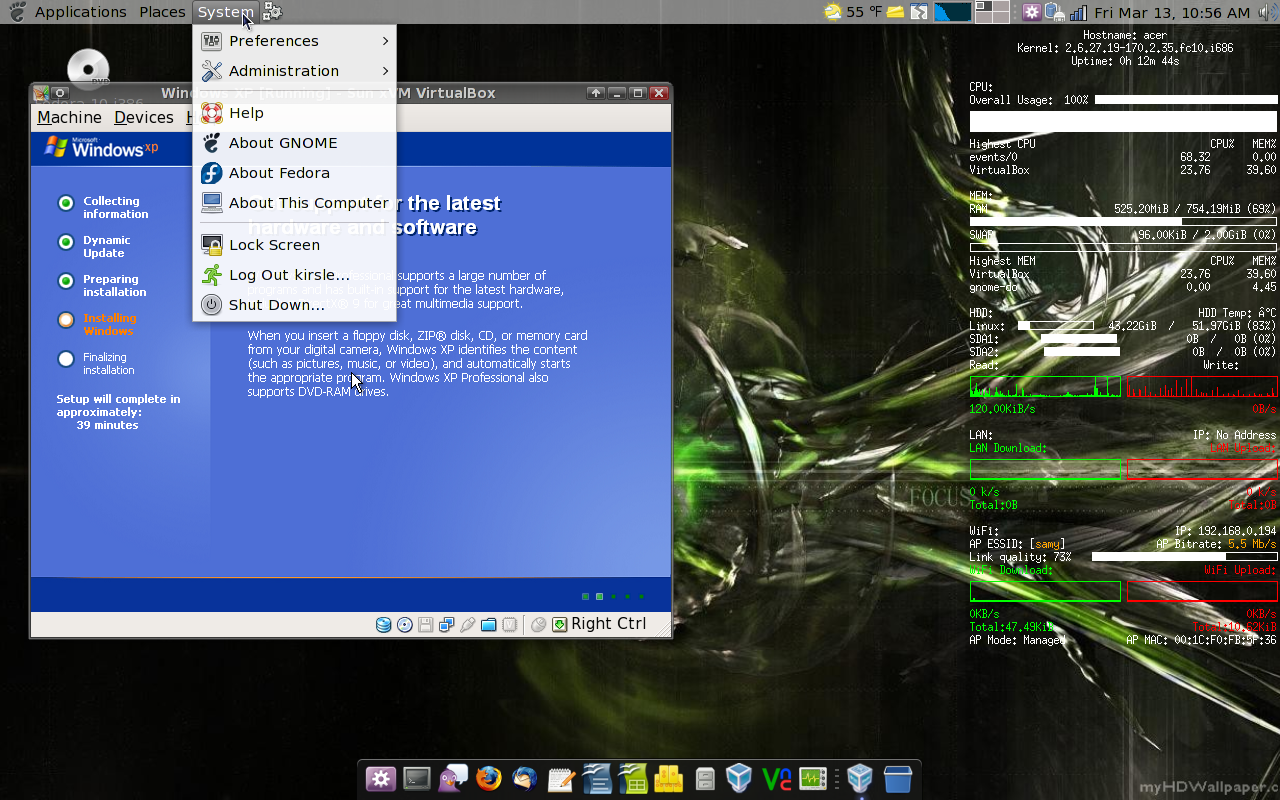
Recently Atheros decided to make nice with Linux and contribute with driver support for Linux. That's cool, except Fedora 9 is all but almost expired and we still have nothing but a hacked Madwifi. In Fedora 10, a built-in kernel module should allegedly have the wireless card work out-of-the-box. But until Fedora 10 is released on the 28th, I'm in limbo.
On my Fedora 9 install I was reluctant to update the kernel knowing that it would break the wireless, especially while the Livna repository didn't have a matching upgrade to the Madwifi hack. But I updated it because there was a matching Madwifi this time, but that made my old (working) kernel 2 versions behind current. So, Fedora installed the new kernel and uninstalled the old one that worked. And, the wireless didn't work anymore with the new kernel.
So, I installed Mandriva Linux. Mandriva is used on the Acer Eee PCs and works heavily with Atheros hardware, and it was known that my particular wireless card works out-of-the-box with Mandriva. And it does. And Mandriva has a pretty default desktop theme. But, it's also a very annoying distro to use.
It's an RPM-based distro, but it doesn't use YUM for its front-end package manager. It uses something called URPMI, which doesn't have a very comparable interface at the command line. That's only an annoyance, but what I have a bigger issue with is how Mandriva replaces standard GNOME utilities with its own "control center" suite, which frankly sucks in comparison.
Mandriva's idea is that they wrapped all system administration tasks -- managing users, hardware, services, software -- into something similar to the Control Panel in Windows. Instead of using the already available, tested and stable GNOME programs, they reinvented the wheel. The most annoying part is that Mandriva's network manager applet really sucks. With GNOME's Network Manager, you can just click the icon on the panel and select the radio box for a wireless network that appears in the dropdown. The applet connects or it doesn't connect and it's really simple and straightforward. Mandriva's system has so much more complexity to it that of course it has bugs.
I can connect to my home network and the network at the office, but many other wireless networks, the applet just refuses to connect to. I click connect and it tells me it's making an effort to do so, but it doesn't, it just sits there forever and ever and doesn't go anywhere. The only way I found to connect is to go into some "Monitor Mode" (some advanced-looking packet monitoring thing that graphs out the network activity) and click some "Connect Wifi" button in there to get the wifi to even connect.
And, I couldn't get the GNOME Network Manager applet to install and work either. Mandriva's custom setup with the network means that the sysconfig scripts for the network devices are dynamically updated by Mandriva's own network program, so that, if I could get GNOME Network Manager to start, it wouldn't be able to find which devices to monitor because anytime I update the config scripts by hand, Mandriva overwrites them again.
Grrrr. I so can't wait for Fedora 10 to come out. >.<
But, instead, I decided to make a completely new design, called "Cosmos". I'm quite pleased with it for now. The jump from designs that were getting gradually lighter and lighter back to something very dark might cause some complications on certain pages. I'll figure that part out later, though.
0.0025s.
![]()